 |
[solved] VS2015 Theme Button Colors |
Post Reply 
|
| Author | |
ScottW 
Groupie 
Joined: 02 August 2005 Status: Offline Points: 82 |
 Post Options Post Options
 Thanks(0) Thanks(0)
 Quote Quote  Reply Reply
 Topic: [solved] VS2015 Theme Button Colors Topic: [solved] VS2015 Theme Button ColorsPosted: 07 September 2016 at 12:19am |
|
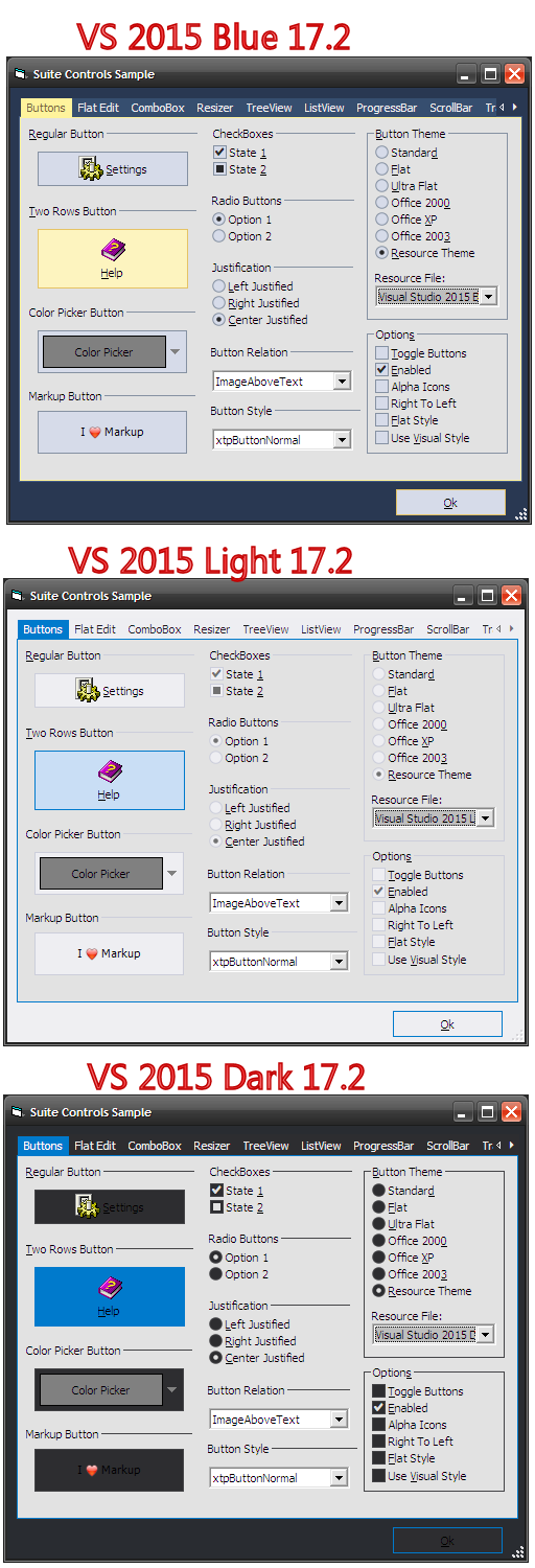
When I use the Visual Studio 2015 Dark theme and set push button appearance to VisualStudio2015, the text is not readable, except when the mouse is over the button. This problem doesn't happen with the other two VS 2015 themes. Is there something that can be done to fix this?
|
|
 |
|
olebed 
Senior Member 
Joined: 01 July 2014 Location: Ukraine Status: Offline Points: 841 |
 Post Options Post Options
 Thanks(0) Thanks(0)
 Quote Quote  Reply Reply
 Posted: 07 September 2016 at 2:13pm Posted: 07 September 2016 at 2:13pm |
|
Hello Scott,
We are working on this issue now. Regards, Oleksandr Lebed |
|
 |
|
ScottW 
Groupie 
Joined: 02 August 2005 Status: Offline Points: 82 |
 Post Options Post Options
 Thanks(0) Thanks(0)
 Quote Quote  Reply Reply
 Posted: 09 September 2016 at 8:50am Posted: 09 September 2016 at 8:50am |
|
I think this might be affecting more than just the PushButton control. The Checkboxes don't seem to look right either.
Any idea when a fix for this might be available? This is my favorite theme, but I definitely can't use it like it is now. |
|
 |
|
olebed 
Senior Member 
Joined: 01 July 2014 Location: Ukraine Status: Offline Points: 841 |
 Post Options Post Options
 Thanks(0) Thanks(0)
 Quote Quote  Reply Reply
 Posted: 09 September 2016 at 9:24am Posted: 09 September 2016 at 9:24am |
|
I suppose you use ActiveX controls (SuitePro), right ? What is version of library ?
Please write also code which you use to set theme. |
|
 |
|
ScottW 
Groupie 
Joined: 02 August 2005 Status: Offline Points: 82 |
 Post Options Post Options
 Thanks(0) Thanks(0)
 Quote Quote  Reply Reply
 Posted: 11 September 2016 at 1:01pm Posted: 11 September 2016 at 1:01pm |
|
I am basically using the same code from the provided samples. You can
see this same behavior in the SuiteControls Sample app for ActiveX. Please note that I have the mouse over the Help button in all three captures. The controls look nice for the Blue and Light themes, but you can't read the text on the buttons in the Dark theme when the mouse is not over them. Also the checkbox and radio buttons probably don't look right either.
 |
|
 |
|
ScottW 
Groupie 
Joined: 02 August 2005 Status: Offline Points: 82 |
 Post Options Post Options
 Thanks(0) Thanks(0)
 Quote Quote  Reply Reply
 Posted: 11 September 2016 at 1:05pm Posted: 11 September 2016 at 1:05pm |
|
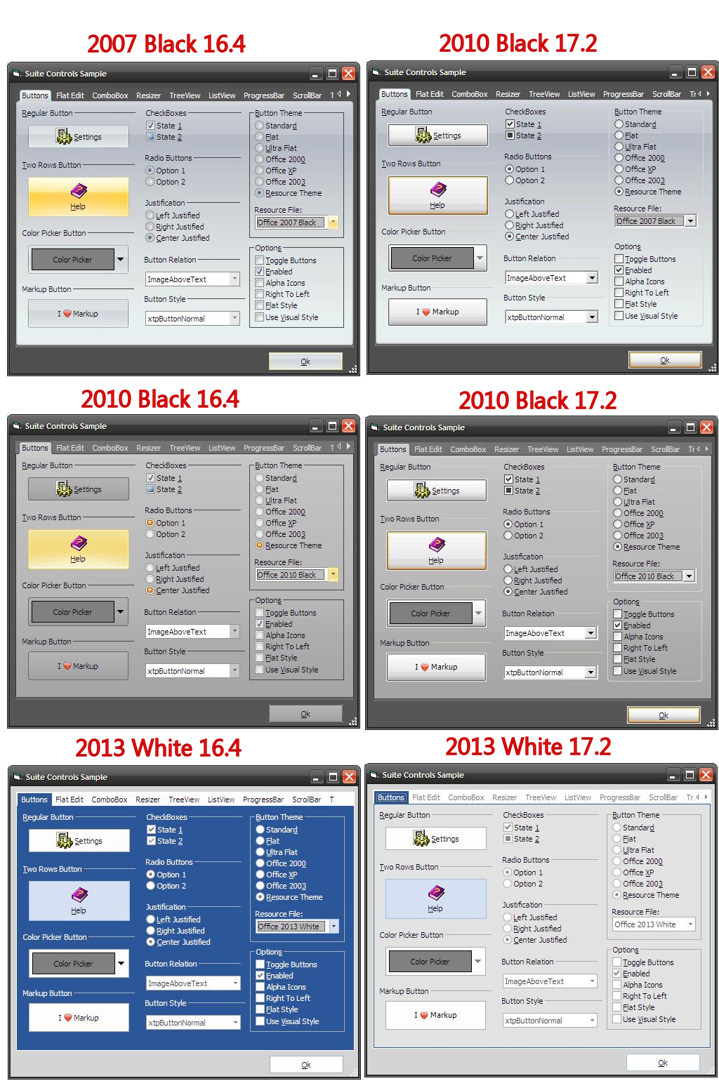
In addition, there seems to be problems in 17.2 with the older resource themes. Before upgrading to version 17, I used to rely on mostly the Office 2010 Black theme. The buttons always had a dark gray background and would highlight yellow. Now with no changes to any code, but upgrading to 17.2, they look plain with no special coloring at all and the buttons between 2007 and 2010 themes look identical. Only the tab control background seems to change now. The buttons still look better for the Office 2013 theme. The tab background is different again and in this case, the newer one looks better.
 |
|
 |
|
olebed 
Senior Member 
Joined: 01 July 2014 Location: Ukraine Status: Offline Points: 841 |
 Post Options Post Options
 Thanks(0) Thanks(0)
 Quote Quote  Reply Reply
 Posted: 19 September 2016 at 1:04pm Posted: 19 September 2016 at 1:04pm |
|
Hello,
I'm glad to inform you that these issues has been fixed! We made some changes in ForeColor of Buttons (also checkbox, groupbox, radiobutton). So now to use text color from theme you need to set vbButtonText (default value)
Also fixed appearance of old themes and vs2015Dark when high contrast black windows theme is used. Thank you for bringing this to our attention. Regards, Oleksandr Lebed |
|
 |
|
ScottW 
Groupie 
Joined: 02 August 2005 Status: Offline Points: 82 |
 Post Options Post Options
 Thanks(0) Thanks(0)
 Quote Quote  Reply Reply
 Posted: 28 September 2016 at 4:27pm Posted: 28 September 2016 at 4:27pm |
|
Thank you.
When will a new version with this fix be available to try? |
|
 |
|
olebed 
Senior Member 
Joined: 01 July 2014 Location: Ukraine Status: Offline Points: 841 |
 Post Options Post Options
 Thanks(0) Thanks(0)
 Quote Quote  Reply Reply
 Posted: 29 September 2016 at 3:33am Posted: 29 September 2016 at 3:33am |
|
We are preparing new version 17.3 now. This can take 1-2 weeks.
|
|
 |
|
ScottW 
Groupie 
Joined: 02 August 2005 Status: Offline Points: 82 |
 Post Options Post Options
 Thanks(0) Thanks(0)
 Quote Quote  Reply Reply
 Posted: 29 September 2016 at 9:00am Posted: 29 September 2016 at 9:00am |
|
Cool, looking forward to it!
I also noticed a few other things with the Dark themes that might be related. You can see these with the provided controls sample app set to the dark theme. The ListView control doesn't seem to observe the dark theme at all. Other controls like the TreeView and List Box, etc. change to black background with white text. ListView doesn't change at all. Also, the scroll bars on many controls don't change either and just show the system theme. When you apply a skin, they do change, but there doesn't seem to be any way to make them look nice with the dark themes. Thanks |
|
 |
|
olebed 
Senior Member 
Joined: 01 July 2014 Location: Ukraine Status: Offline Points: 841 |
 Post Options Post Options
 Thanks(0) Thanks(0)
 Quote Quote  Reply Reply
 Posted: 07 October 2016 at 8:09am Posted: 07 October 2016 at 8:09am |
I think that is because dark themes should be used with high contrast black windows theme. We have fixed some controls in VS 2015 Dark theme, except scrollBars. |
|
 |
|
Post Reply 
|
|
|
Tweet
|
| Forum Jump | Forum Permissions  You cannot post new topics in this forum You cannot reply to topics in this forum You cannot delete your posts in this forum You cannot edit your posts in this forum You cannot create polls in this forum You cannot vote in polls in this forum |