 |
[v17.3] In-place Button Frames |
Post Reply 
|
| Author | |
cpede 
Senior Member 
Joined: 13 August 2004 Location: Denmark Status: Offline Points: 666 |
 Post Options Post Options
 Thanks(0) Thanks(0)
 Quote Quote  Reply Reply
 Topic: [v17.3] In-place Button Frames Topic: [v17.3] In-place Button FramesPosted: 18 January 2016 at 8:22am |
|
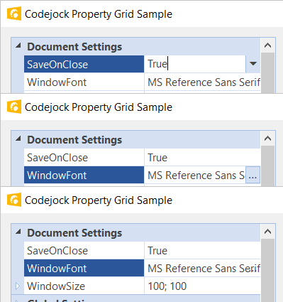
The frame around the in-frame buttons for Drop-down and for Browse are different.
Using the xtpGridThemeOffice2013 theme  -cpede
|
|
|
Product: Xtreme ToolkitPro (24.0.0)
Platform: Windows 10 (x64) Language: Visual Studio 2017 (C++) |
|
 |
|
cpede 
Senior Member 
Joined: 13 August 2004 Location: Denmark Status: Offline Points: 666 |
 Post Options Post Options
 Thanks(0) Thanks(0)
 Quote Quote  Reply Reply
 Posted: 27 September 2016 at 6:00am Posted: 27 September 2016 at 6:00am |
|
Can anyone confirm that this will be fixed in v17.3?
-cpede
|
|
|
Product: Xtreme ToolkitPro (24.0.0)
Platform: Windows 10 (x64) Language: Visual Studio 2017 (C++) |
|
 |
|
cpede 
Senior Member 
Joined: 13 August 2004 Location: Denmark Status: Offline Points: 666 |
 Post Options Post Options
 Thanks(0) Thanks(0)
 Quote Quote  Reply Reply
 Posted: 31 October 2016 at 5:21am Posted: 31 October 2016 at 5:21am |
|
This is not fixed in v17.3.
Please refer to Property Grid Sample with Office2013 Theme.  Drop-down and Browse button frames looks different? And the property item text is overlapping the "..." Browse button, when not highlighted? -cpede
|
|
|
Product: Xtreme ToolkitPro (24.0.0)
Platform: Windows 10 (x64) Language: Visual Studio 2017 (C++) |
|
 |
|
Post Reply 
|
|
|
Tweet
|
| Forum Jump | Forum Permissions  You cannot post new topics in this forum You cannot reply to topics in this forum You cannot delete your posts in this forum You cannot edit your posts in this forum You cannot create polls in this forum You cannot vote in polls in this forum |